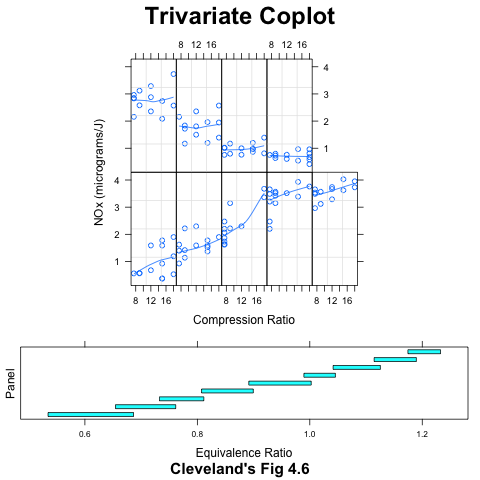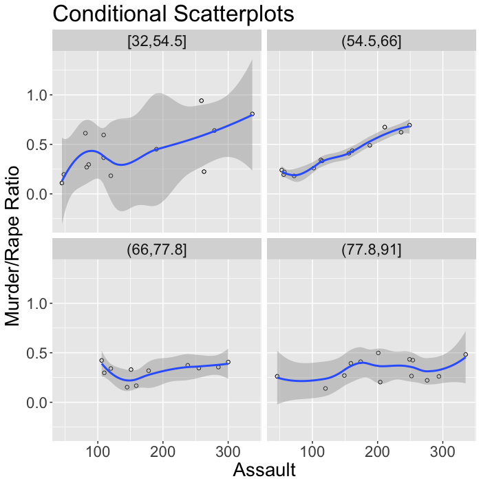

This page illustrates graphical analysis of trivariate data, using figures from Chapter 4 of Visualizing Data, by William Cleveland. Figures were made with ggplot2 (left column) and Lattice (right column). Click on a figure to see the code that made it.
The ggplot2 and Lattice versions below look different, because Lattice supports "shingles", which are overlapping categories. Lattice also uses a graphic scale to indicate the values covered by each shingle. In ggplot2, the groups do not overlap, and there is no easy way to indicate that the numbers at the top of each panel represent a range of populaion sizes.
This plot doesn't seem feasible in ggplot2: