
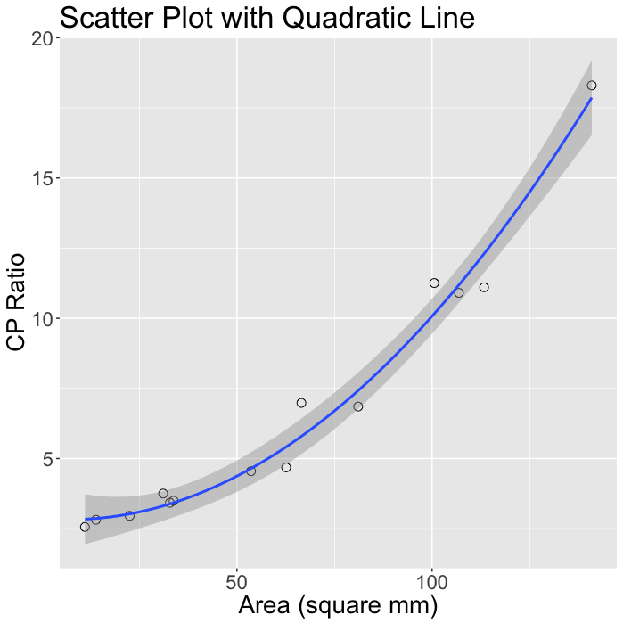
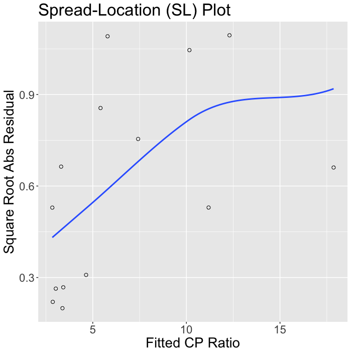
This page illustrates graphical analysis of bivariate data, using figures from Chapter 3 of Visualizing Data, by William Cleveland. Figures were made with ggplot2 (left column) and Lattice (right column). Click on a figure to see the code that made it.


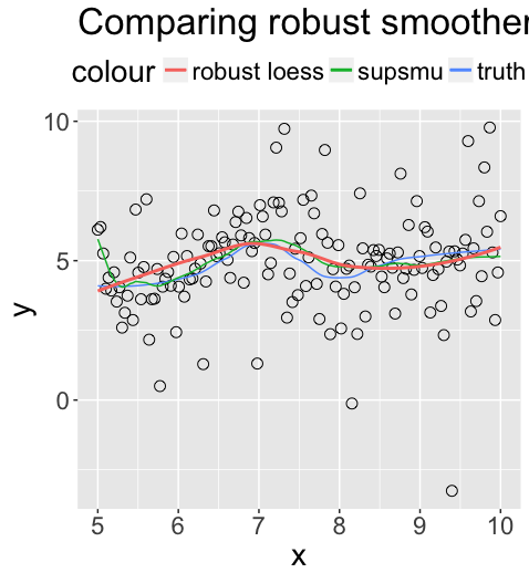

I wrote my own function to do the figure below--a loess curve with bootstrap condifence region. Under the hood, it's in Lattice. I see no reason to rewrite it in ggplot2, so there is only one version.
